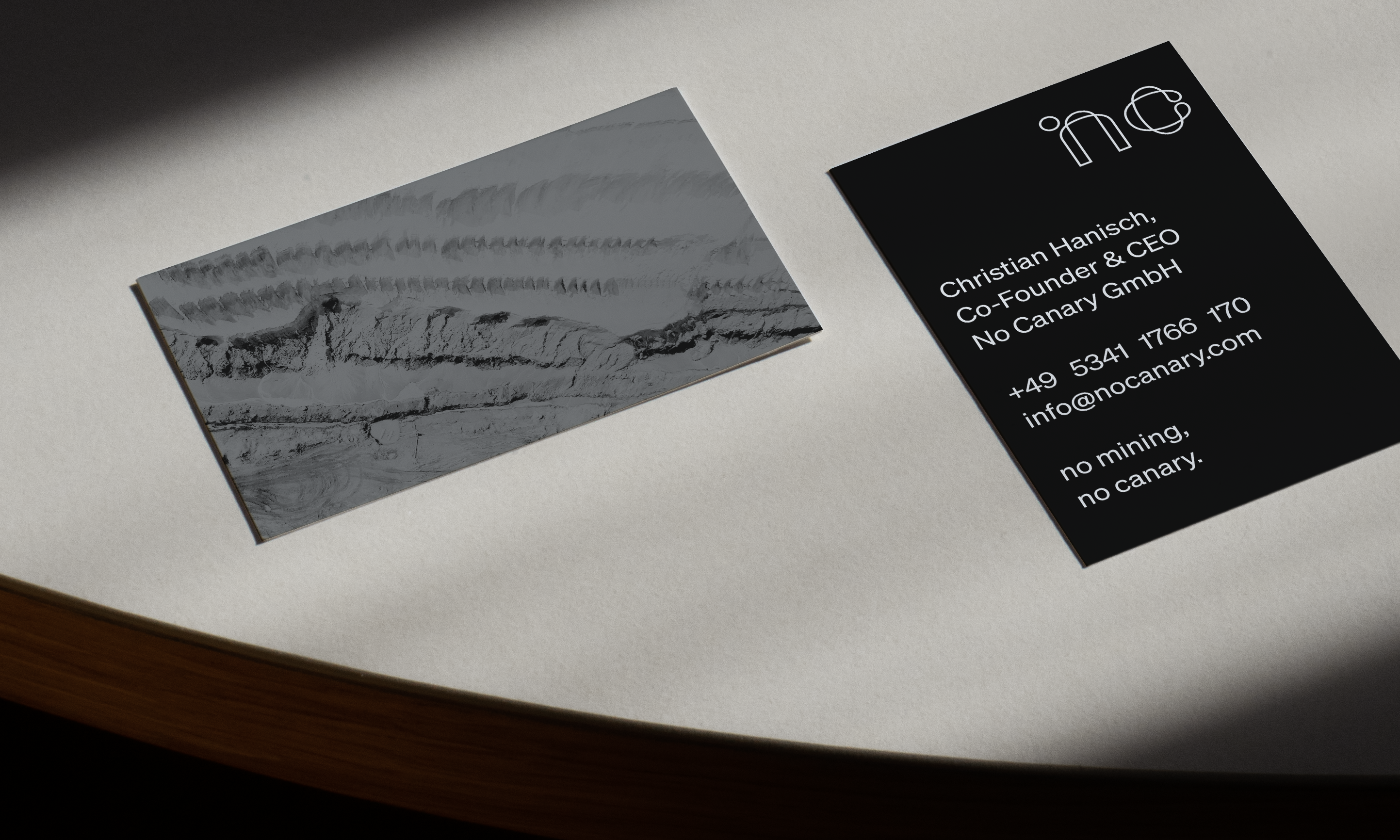
No Canary
Brand design for battery recycling machine constructor
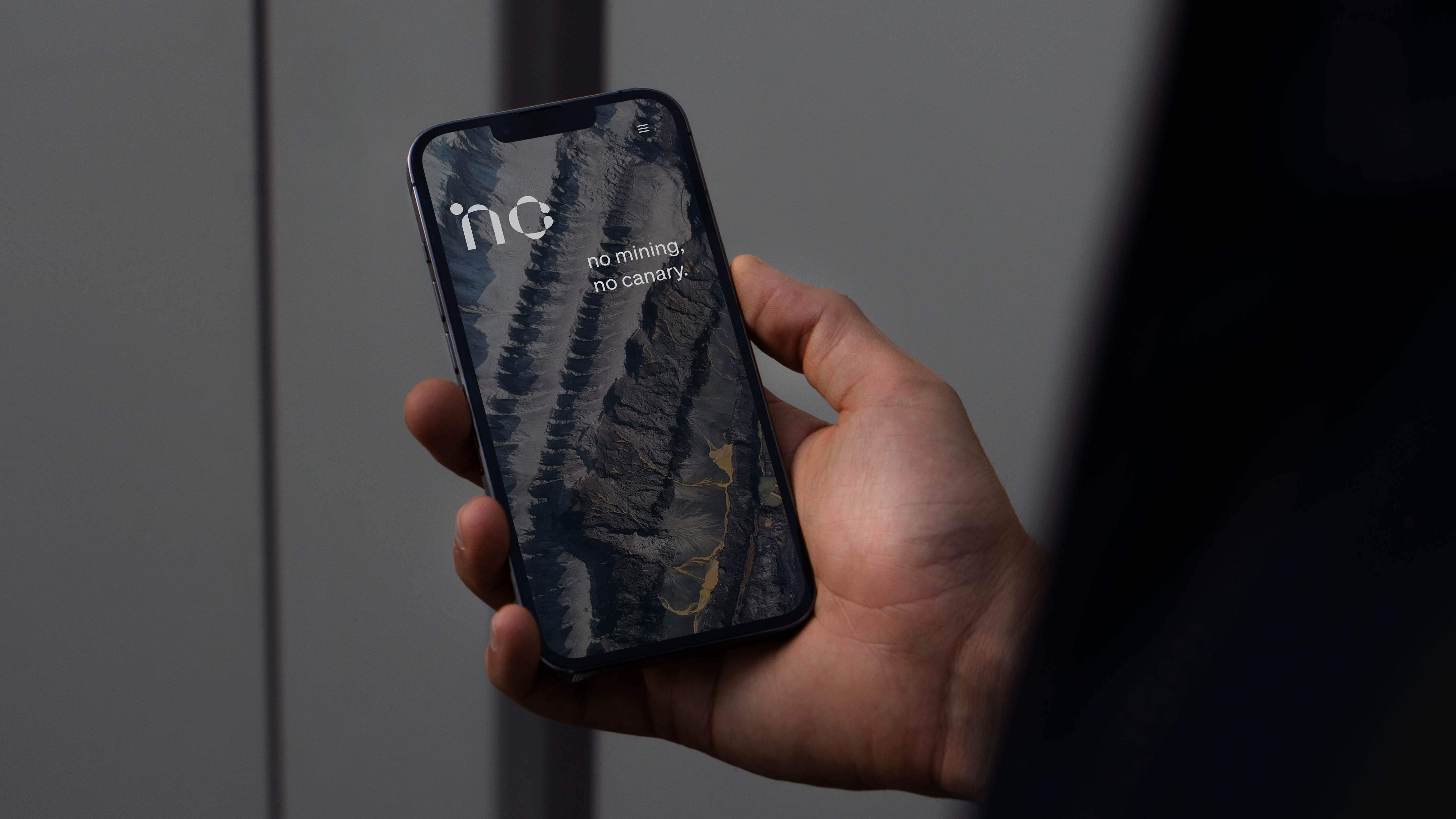
No mining, no canary.
Application
For German battery recycling machine constructor ‘No Canary’ I designed a new logotype and web presence.
Logotype – development process
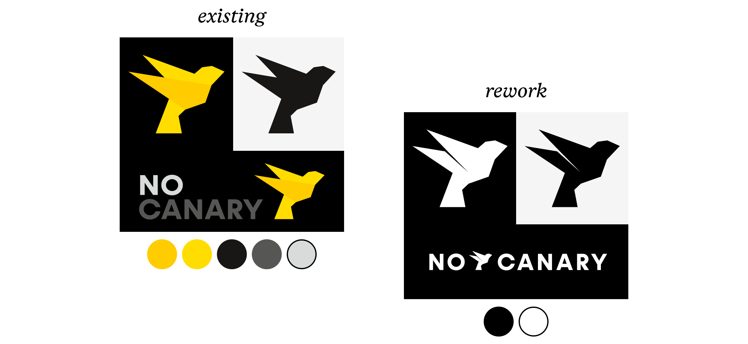
I started the design process by deconstructing the existing logotype. It did not convince me at all:
- Icon: The abstract canary bird is unrefined and does not seem to fly. It is not uniquely recognisable. It would be more consequent to omit the canary bird.
- Colour: The dependency on five colours complicates the application.
- Typography: The typeface looks too generic, the tracking is too narrow.
- Layout: The combination of wordmark and icon leaves an undesirable negative space. Combining a typeface with an icon is tricky.
In the rework I could address a few issues. However, I decide to remove the canary bird icon and instead strengthen the visual association to the company’s competence – battery recycling. I chose to focus on typography.

I tried a different typeface: The wordmark ‘no canary’ is set in ‘The Future’, a reinterpretation of Futura. The negative space between ‘ry’ references an arrow.
When I customised the typeface, I appreciated the quality of well-proportioned and sharply defined space between letters. Later in the design process, the search for this quality influenced my choice of typeface for bread text.
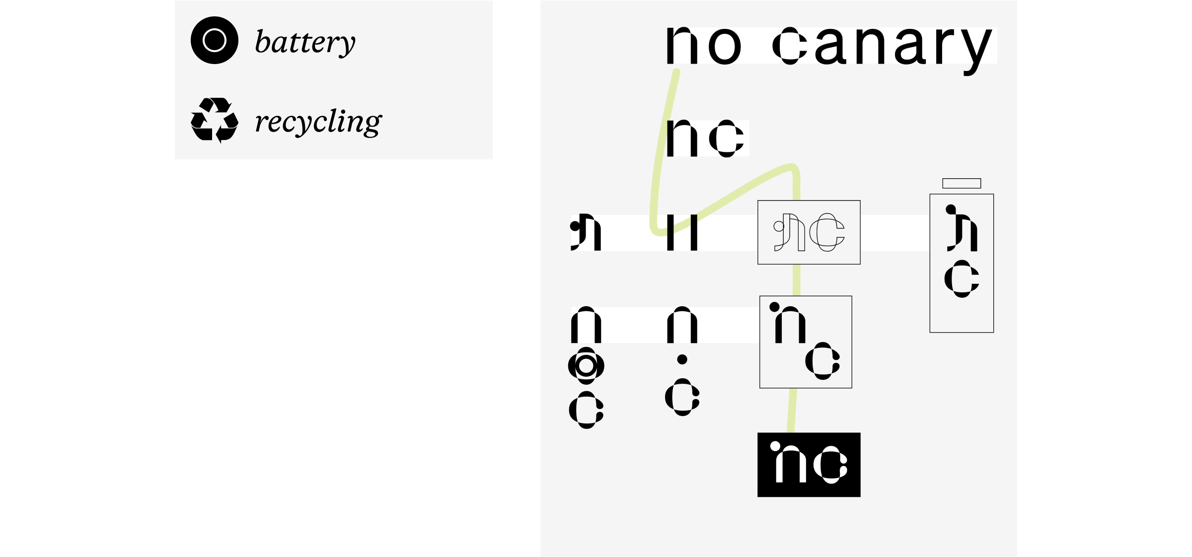
The ‘°nc’ wordmark emerged from the approach to symbolise battery recycling. The typeface ‘Parabole’ by Dávid Molnár features twists, like a curling ribbon or recycling arrow. I customised the letters and ended the c in drops.
Choice of typeface for bread text
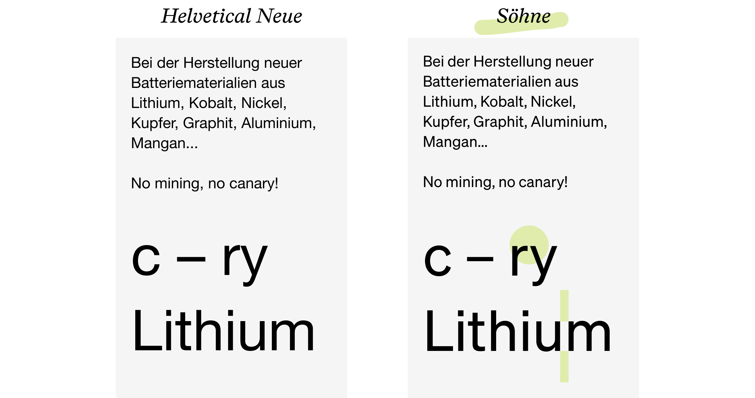
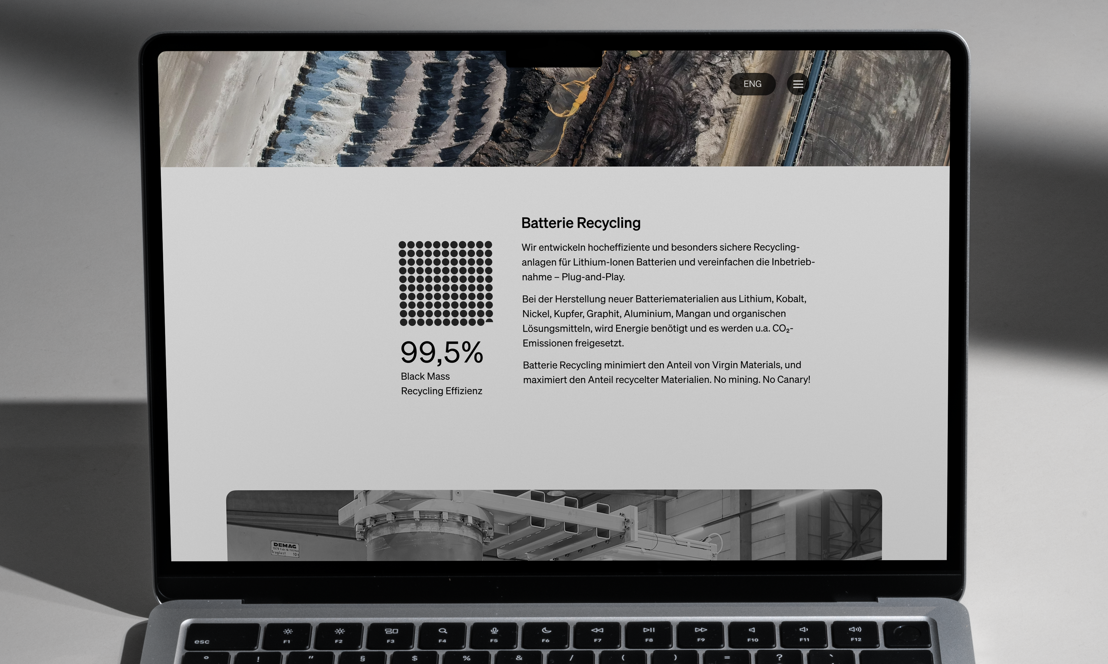
The company ‘No Canary’ is driven by research and engineering. It is German, bold, and honest. I searched for a fitting sans-serif typeface. I took ‘Helvetica Neue’ as a comparison for evaluation. I looked at different options, such as Diatype, Akkurat, and Favorit.
I discovered many qualities that convinced me to pick ‘Söhne’ by Klim. It is refined, harmonious and stands out. Compared to Helvetica Neue, the typeface is more open and isolates better from the background. The ratio between the width of stems to the space in between letters provides more contrast. The letter shapes and kerning leave enough space – letters don’t stick to each other.
Logotype – result
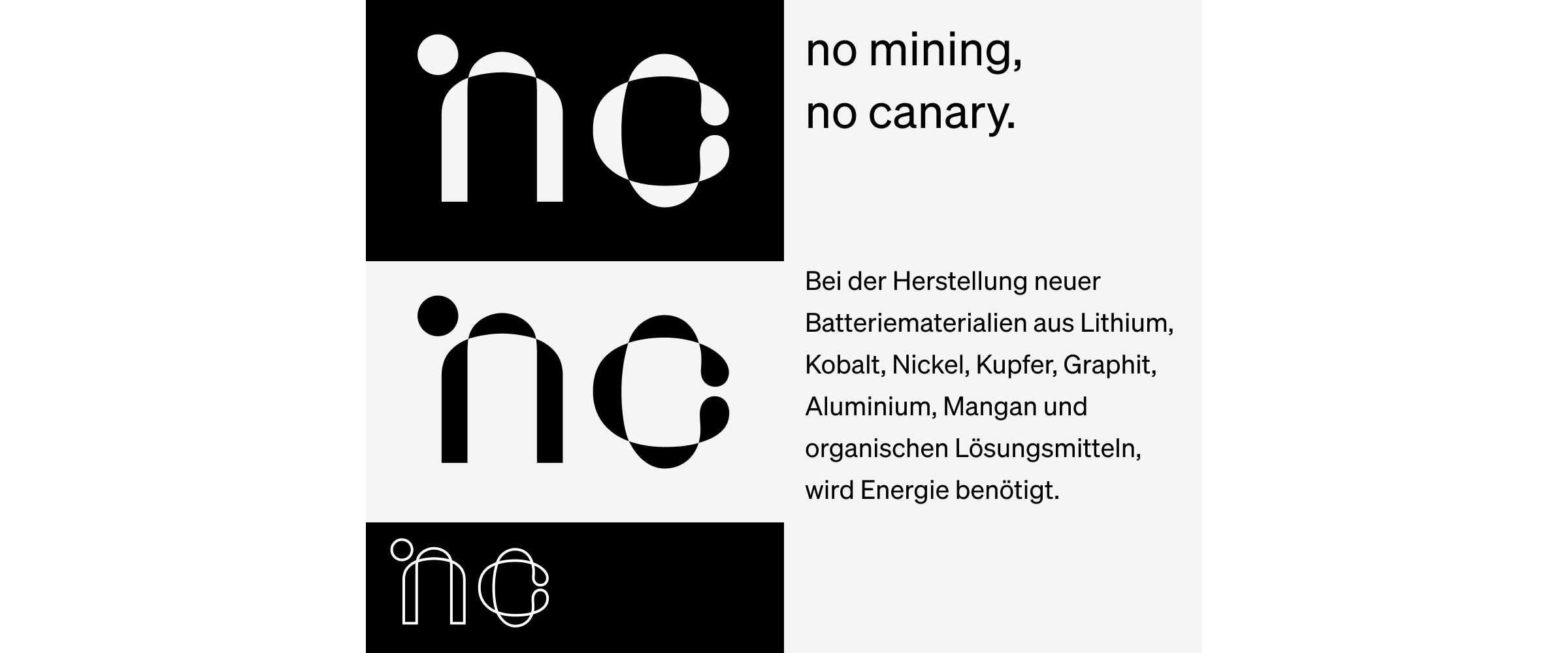
The final logotype does without an icon. The customisation of the ‘°nc’ wordmark contains a reference to battery recycling. It does not spell out ‘no canary’ and lets the beautiful bread text do the talking. ‘Söhne’ has exceptional graphic quality at all sizes.